Friday, March 27, 2015

Typography Images

Typography is a way to express feelings, thoughts and/or a message in a picture with words. It can make a long lasting impact with the fact that it can get a strong message across to the viewer that can change minds or persuade.

My biggest challenge while doing this project was trying to figure out how to do certain things and trying to find the right words to describe myself. The tutorial that Mr. Sanderl gave us also helped a lot when things were confusing.


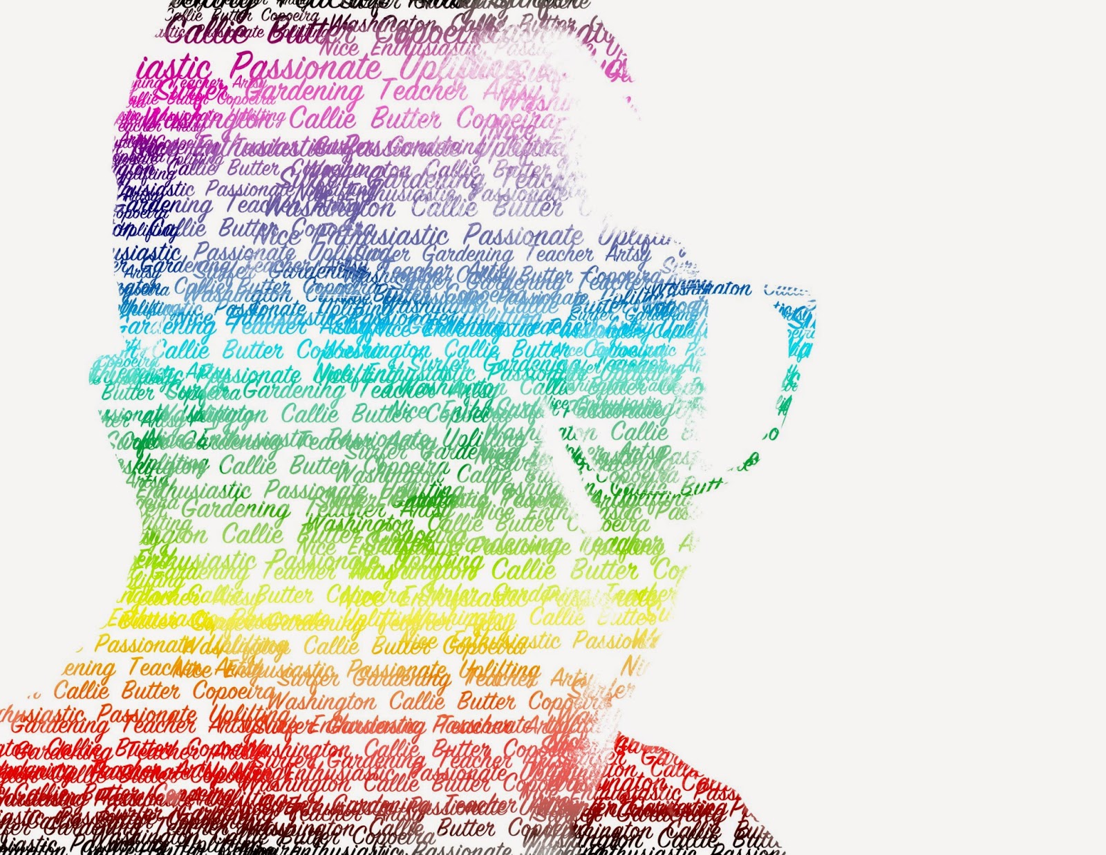
 My favorite typography portrait of all the ones I did would have to be the Innovator portrait because it was definitely the easiest and to me it looks the best because there's no bright colors and it was really easy to understand and depict who the picture is. The second picture is Mrs. Sanderl and it has the words Passionate, Uplifting, Teacher, Coperia, Callie, and Butter. She said these words describe her and that's what I put.
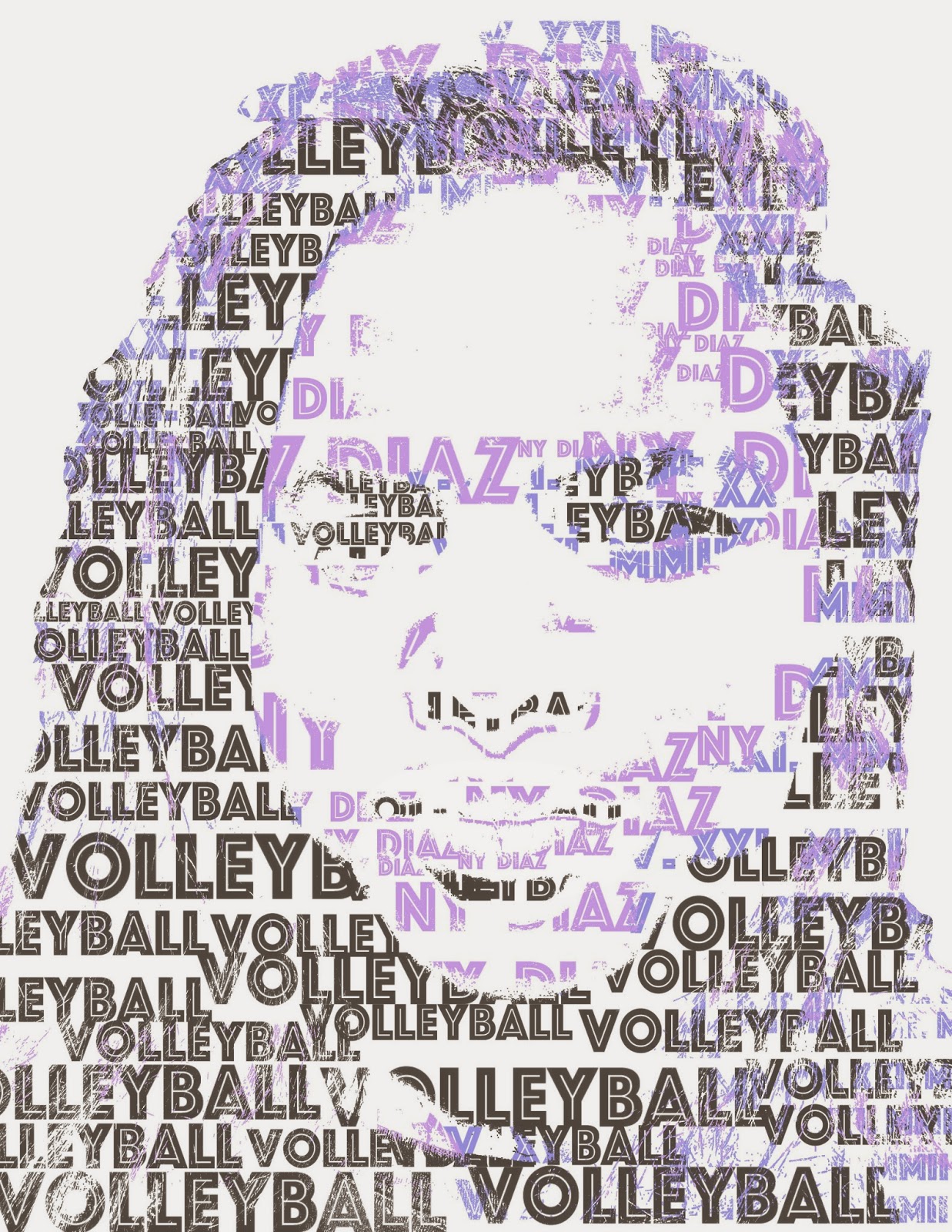
For my typography portrait, I chose the words Volleyball, V.XXI.MMII, and NY Diaz. I choose these words because volleyball is a very strong passion that I have and I love to do it. I chose V.XXI.MMII because it's my birthday in Roman Numerals and I love birthdays, the more you have the longer you live and you're one step closer to achieving your life long goal. Lastly, I chose NY Diaz because New York is where I was born and where I grew up and it defines me because it's my hometown and that's where my roots come from and where I was made. Diaz is just important because it's my last name and that's pretty basic. 

Monday, March 2, 2015

Double Exposure Portraits

Portrait Photography is a picture of a person or group of people. A profile view is a picture of the side of a person's face, while silhouetting is a dark shape or outline with a lighter background. We used portrait photography to make our Double Exposure and Multi Exposure portraits.

This week, we did double exposure portraits in Photoshop. To make these, we needed a profile view of ourselves and two textural photos to show symbolism. First, it's File > Scripts > Load Files into Stack. You add your three pictures and it all comes out in layers.
Next, you need to use the dodge tool to lighten the areas around your face to make it completely white. After that's finished, you need to change all your blending modes to "Screen". And then you become, kind of transparent but you can see your background pictures. To make it look really cool, I made my background photos invert colors and they came out a nice purple by going to Layer > New Adjustment Layer, then using whatever look cool.
Practice
The symbolism in my two visual samples are the clouds and the horizon. I always wondered what's beyond the clouds and space and what's in other galaxies. For my other visual of the horizon line, I've always wanted to travel and see what's beyond the curves of the Earth and past where the eye can see. My quality of work could've improved by having my visuals be more unique and trying to think outside of the box more. 
Multi Exposure